Friday, 16 August 2013

Free Textured Backgrounds

Here's a collection of textured backgrounds to use, i have used these with text edits and image edits.


Free Fonts


Marcelle Font
Created by Stereo Type
Perfect for that old fashioned printing press look.


Download Marcelle font here

Abraham Lincoln
Designed by Frances Macleod


Tuesday, 30 July 2013

Free Fonts to download

Linny


This Font is actually the designer's s real handwriting.

Download Linny Font

Baron


This Typface was designed by Frank Hemmekam.
Its free for commercial and personal use and you can share your art using the font.

Friday, 19 July 2013

Staircases

Earlier I stumbled across a picture of weird stairs and started to look at weird staircases here are some of what I found.


Inspiration

I was looking for some unusual inspiration and came across these images.

The Futuristic invention of 'The Pram Car'


Designing an Egg shell. The detail below in this picture and the different snap's show just how elegant and fragile that little Egg shell is.

Ethan Ford

Ethan Ford, A Pen and Ink Artist from Manchester. UK Created these few pieces on the Ipad.


To view more of his work visit EthanFord


David Collins


Interior designer David Collins, famed for his work on restaurants including The Wolseley, Claridge’s Bar and Bob Bob Ricard, has died.

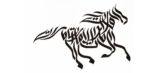
Calligraphy Logos

Thursday, 18 July 2013

Company re-branding

The company known as YouSendIt, one of the longest running file,sync and share sites,  is now known as HighTail. 

“Our aspirations as a company go way beyond just send. The name YouSendit constrained us in terms of our vision for the opportunities ahead, and I think as we move to this new name it gives us a much wider playing field to be an impact player in that broader opportunity,”

“With a name that strides like a giant across a landscape of Boxes, Syncs and Shares alongside an audaciously elegant look that contrasts with the endless dreary blues of the cloud space, Hightail leads by example,” said Hightail CEO Brad Garlinghouse.


Free Fonts

There's Free Fonts at fontfabric Some of which i think are quite good


Friday, 12 July 2013

Pricing Jobs


Well when i started my business in Graphics i researched into pricing a lot. Personally when your a small local business i charge a standing set rate. That way it doesn't effect my customers purely a simply because adding to the price because of changes is the same as builders adding extra's to your bill and its annoying and pretty much the same as scamming. You get paid for the time you spend on the project so why charge more on top?

Thursday, 11 July 2013

Creativity


Created by Tim Burton


“Bread & Butter” book cover design by Emily Mahon


Diogene

“This little house is the final result of a long, long journey partially driven by desires and dreams, but also by technicality and a scientific approach.” — RENZO PIANO


Inside this little house is a sofa, a desk area, a shower, toilet and a basic kitchen. The house collects, purifies and re-uses its water and supplies everything. This building was named after an Ancient Greek Philosopher Diogenes of Sinope who apparently lived in a barrel because he considered normal things to be an unnecessary luxury.


Wednesday, 10 July 2013

How a Designers Brain Works

10 Typography Tips


1. All designers prefer different Fonts but these all the general likes and dislikes.


2. Don't use too many typefaces - I'm sure you've all heard the expression less is more?

3. The Typefaces are for certain texts such as headers and sub-headings. Don't mix and match


4. Pay attention to Hierarchy. You need a clear title maybe a subtitle and a body. You can achieve this by using the right font, size and signals.

5. Don't make something fit what you have created, the typist has done it professionally.

6. Kerning, Tracking and leading ( Line space, Letter space and paragraph space) Bad spacing makes you're work ugly on the eye.

7. Only use Signals (bold, Italics, Underline etc..) to highlight important parts of text.

8. Colours - coloured text or background. both use of colours need to compliment each other by having a high contrast against each other so it is easy for people to read and naturally draws the eyes attention.


9. Use your punctuation correctly.

10. Don't use double spacing - It looks awful!!!!


Wednesday, 3 July 2013

Colour


As every Designer or Artist knows, colour is important. Different colours make the audience react in different ways due to the brain and the feelings we associate with certain colours.
Colours activate the left side of the brain(emotions) while text activates the right side (logic)
All colours are made from the primary's, Black, White, Red,Yellow and Blue. When you combine these again you get three secondary colours, Orange, Purple and green. When you combine each secondary colour with its neighboring primary, you get six terrortory colours: yellow-orange, yellow-green, blue-green, blue-purple, red-purple, red-orange.